
INTRODUCTION
- LENUSA: is a the leading technology and innovative solutions provider for the live-event industry in the United States.
- VISION: To revolutionize the power of the Latino market throughout the world.
- MISSION STATEMENT: Lenusa will use entertainment as a vehicle to reach the Hispanic community for, economic, cultural, and political empowerment.
- OBJECTIVE: To strategically build the future of the Latino entertainment industry through technical and entrepreneurial innovation.
- SERVICES: Services range from state-of-the-art ticketing platforms, event management software, sponsorships, marketing support & new revenue generators.
- Nationality: United States
This document aims to give basic guidelines for the use of LENUSA design assets. The logo and various other assets can be given by request only.
BRAND ASSET REQUEST
Please submit a request for permission when you need to use brand assets
MARKETING OR ADVERTISING THAT APPEARS ON TV OR ONLINE
BOOKS, VIDEOS, PLAYS, TV SHOWS AND FILM SCRIPTS
PRINT PACKAGING
Advertising appearing on our products will be reviewed by our Ad Policy team and does not require permission here.

For any questions, or for access to further assets, please contact the marketing LENUSA team at marketing@lenusa.com
All other forms of marketing do not require permission but must use the officially provided assets and abide by the guidelines on this site.
BRAND ASSETS
The LENUSA logo is a key part of the brand’s indentity and helps express who we are.
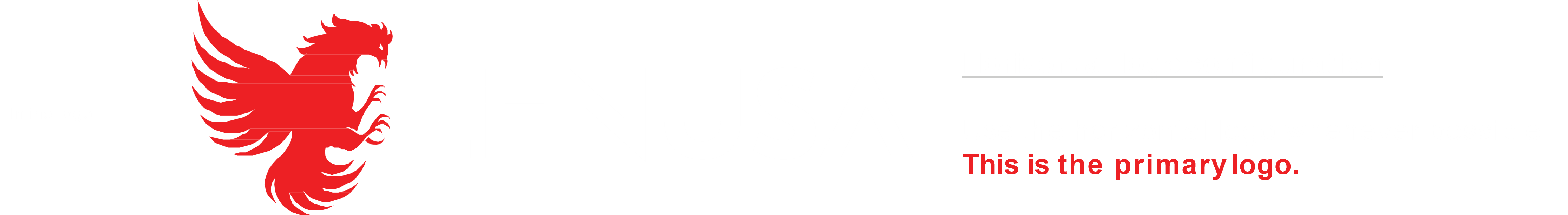
LOGO USAGE OVERVIEW
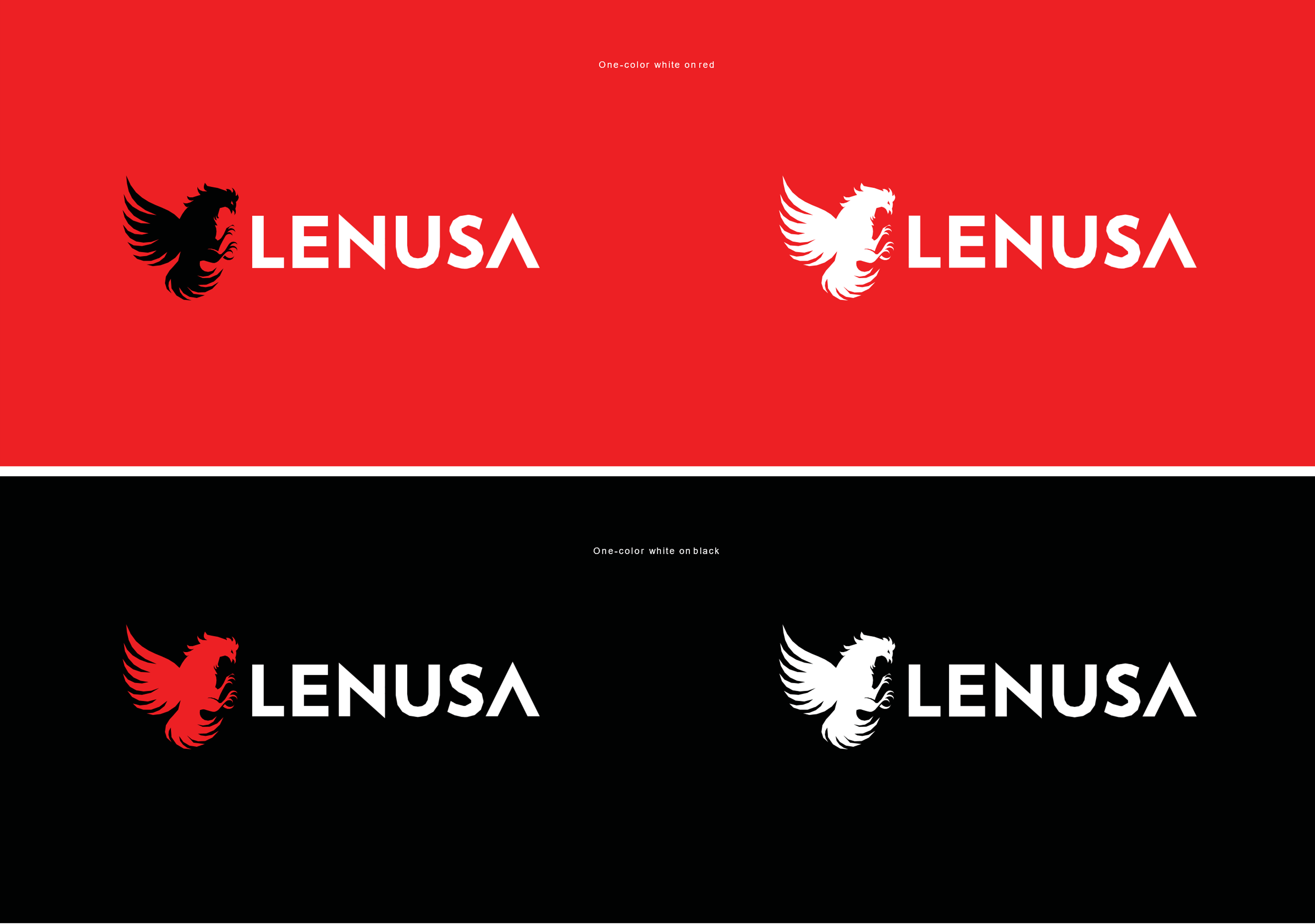
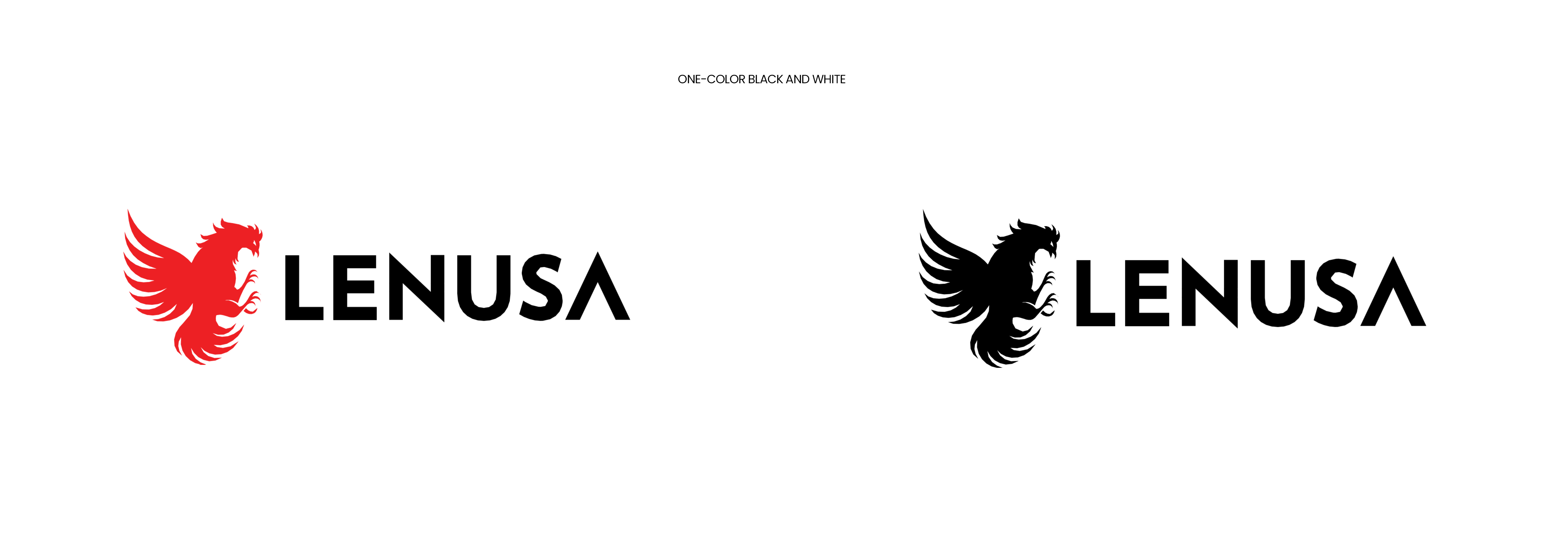
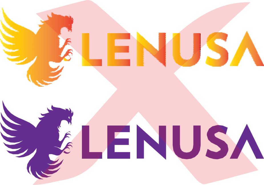
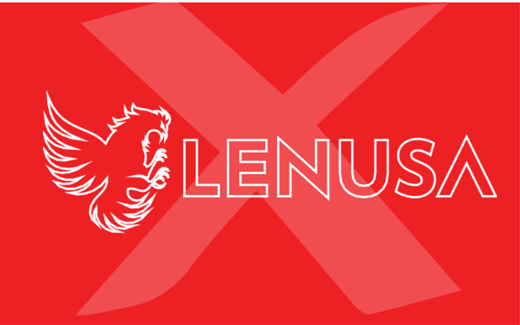
Use a full color logo on either Lenusa Red, black or white background whenever possible. If full color is not available or appropriate, any of the alternate one color versions may be used as well.
DO keep to the recommended minimum widths
- 40 pixels for digital and 10mm for print

40px (digital)
/ 10mm (print)
TALKING ABOUT LENUSA— DO’S AND DONT’S
Here are specific guidelines to follow when mentioning LENUSA:
DO
Capitalize the word LENUSA except when it’s part of a web address.
Display the word “LENUSA” in the same font size and style as the content surrounding it.
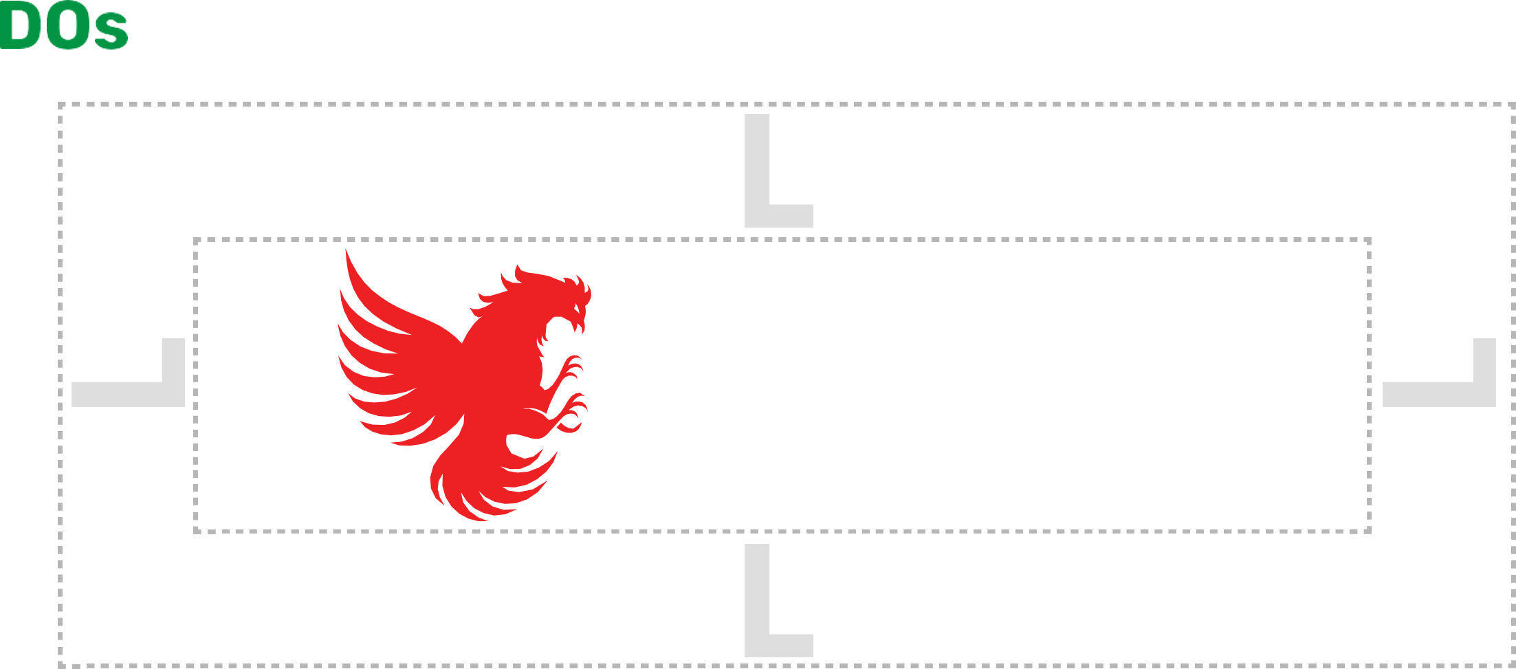
Give the logo enough room to breath by leaving a clear space between it and any other design elements, or the edges of the page. The clear space is defined by the height of the gap in Icon of the logo.
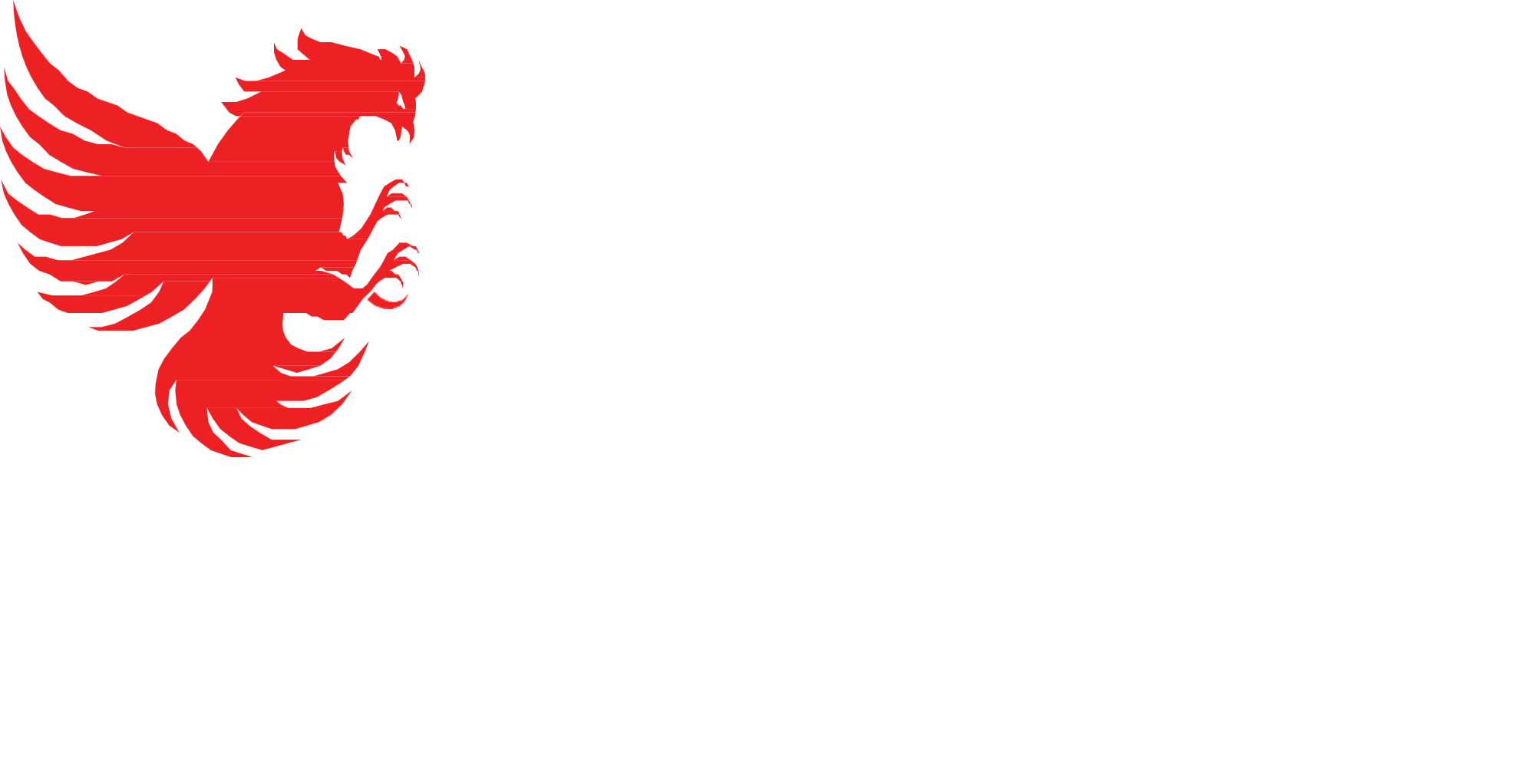
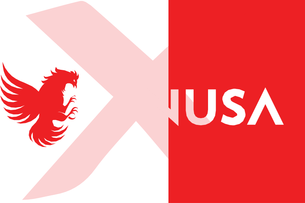
Sit the logo over photography, color backgrounds, or the LENUSA collage. If using over photography, try to find an area of the image with less going on, providing a solid background for the logo to sit on.
Try positioning the logo on a join that crosses through the middle of it horizontally. This can be particularly useful when you have a busy image which difficult to lay text over, as it allows you to split the design into two sections but use the logo to hold them together.
DO NOT
Don’t use LENUSA logos and icons in place of words.
The only approved lockups can be found on the Brand Resource Center
BRAND PERMISSIONS
When to use the LENUSA company logo
Partnerships or sponsorships with a formal agreement in place with LENUSA Newscasts and news programming Editorials
Books, plays, talk shows, TV shows and film scripts
Print packaging
Marketing or advertising that appears on TV or online
The LENUSA logo is a key part of the brand’s indentity and helps express who we are.
The following guidelines will help you reproduce the logo to the highest standards and maintain a strong, consistent visual identity. They include some DOs and DO NOTs..
The following guidelines will help you reproduce the logo to the highest standards and maintain a strong, consistent visual identity. They include some DOs and DO NOTs..
LOGO CONFIGURATIONS
DON'Ts
DO NOT distort or stretch the logo in any way. When scaling, use the proper linked proportions.
DO NOT rotate the logo.
DO NOT add drop shadow or glow to the logo.
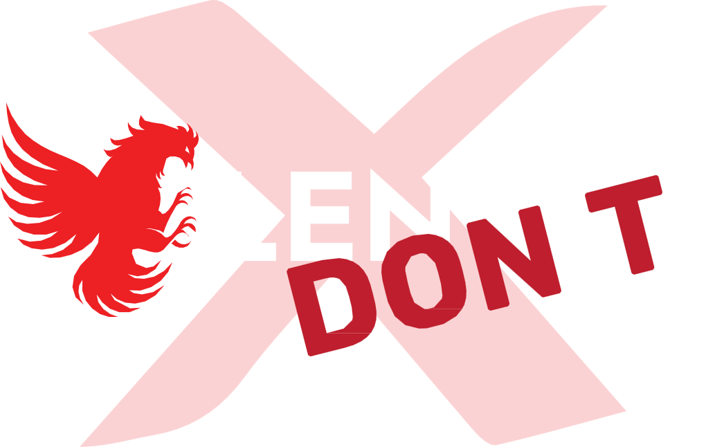
DO NOT cover any of the logo with text or any other elements.
DO NOT crop the logo or flip the icon in any way.
DO NOT alter the color of the logo in any way other than those prescribed in these guidelines.
DO NOT add a white stroke around the logo when placing in any back- ground..
DO NOT place the logo over a vertical join. This treatment is to be used on horizontal joins only.
LENUSA NETWORK
LENUSA PRODUCTS & SERVICES


These guidelines have been produced in order to create consistency for all groups and networks branding. Colour, exclusion zone, and minimum size guidelines for these are the same as for the main master logo.
Logo layout should follow:
LENUSA Rooster Logo on left
1pt rule
LENUSA workmark on the right
Group/Network name in Poppins Medium
Logo Color
Specifications
Color specifications are different across various media applications. Therefore, it is important to use the correct color mode for the specific media application to achieve the intended colors..
test